The kitchen has stopped playing it safe. After years of greige cabinets and neutral everything, homeowners in 2026 are swinging the door wide open to color, real, confident, saturated color. A deep navy blue, a warm burnt orange, even a punchy sage green on cabinetry that once defaulted to white. The trend isn’t reckless: it’s thoughtful. Colorful kitchen design works when you understand how colors interact, which surfaces carry the most visual weight, and how to make bold choices that don’t fade in appeal after six months. This guide walks you through the practical side of bringing color into your kitchen, from selecting a palette that fits your space to executing the finish work without the regret.
Table of Contents
ToggleKey Takeaways
- Colorful kitchen design is trending in 2026 because bold, saturated colors on cabinetry and walls signal intentionality and boost mood without requiring a full renovation.
- Modern cabinet finishes, including lacquer and acrylic enamels, now hold color reliably for 10+ years, making homeowners confident to commit to bold color choices.
- Test paint samples at different times of day and under your existing kitchen lighting—colors shift dramatically under morning, midday, and evening light.
- Successful colorful kitchen color palettes start by anchoring to fixed elements like countertops, flooring, and appliances, then balance either complementary schemes (opposites on the color wheel) or monochromatic approaches (one color family).
- Proper surface prep is non-negotiable when painting existing cabinets—thoroughly clean, sand, and prime before applying cabinet-grade enamel or lacquer to avoid peeling or fading.
- Layer color intentionally across cabinets, walls, backsplash, and hardware; soften saturated cabinet colors with lighter wall tones, and use complementary accents like brass hardware or patterned tile for visual harmony.
Why Colorful Kitchens Are Trending Now
The shift toward colorful kitchens comes down to personality and permanence. After pandemic-era spending on home upgrades, owners realized that timeless doesn’t mean bland. Colored cabinetry and walls create instant character without requiring a full layout overhaul. It’s a refresh, not a gut renovation.
Color also signals intentionality. Neutral kitchens read as generic: a thoughtfully colored kitchen says the homeowner made a choice, considered the space, and committed to it. Psychologically, bold kitchen colors boost mood and energy in a room where people spend significant time cooking, eating, and gathering.
Practically, modern cabinet finishes, especially lacquer and acrylic enamels, hold color better than they did five years ago. Paint technology, improved primer formulations, and better prep methods mean colored cabinets can last 10+ years without fading or peeling if you apply them correctly. That stability has made homeowners confident enough to go bold.
Choosing Your Kitchen Color Palette
Start by assessing your kitchen’s fixed elements: countertops, flooring, appliances, backsplash tile (if staying), and wall color. These anchors set boundaries for what works. A kitchen with warm-toned wood cabinets and cream tile plays better with warm colors (terracotta, mustard, rust). Cool gray countertops and stainless steel appliances pair cleanly with cooler hues (navy, forest green, slate).
Next, decide how much color you want. Are you painting all the cabinets, or using color as an accent on an island? Upper cabinets only? A single wall? The proportion matters. A fully colored kitchen reads as intentional: a single painted wall needs enough visual weight to avoid looking hesitant.
Light and artificial lighting shift color perception dramatically. Test paint samples on your cabinet doors or walls and observe them at different times of day, early morning, midday, and evening under your existing kitchen lights. A blue that looks crisp at noon might lean purple under incandescent bulbs at night.
Complementary Colors vs. Monochromatic Schemes
Complementary color schemes use hues opposite each other on the color wheel (blue and orange, green and red). They create energy and visual pop. A navy island against warm wood perimeter cabinets is a complementary contrast that works well in open-concept kitchens.
Monochromatic schemes stick to one color family, say, all greens ranging from sage to forest, or multiple shades of blue. These feel cohesive and calm. They’re also forgiving if you’re less confident in your color intuition. Recent interior design color trends show monochromatic kitchens trending strong because they read as sophisticated and easier to live with long-term.
Most successful 2026 kitchens blend the two: a dominant color (say, sage green cabinets) with a complementary accent (warm brass hardware, terracotta backsplash). This hybrid approach gives personality without visual chaos.
Popular Color Combinations for 2026
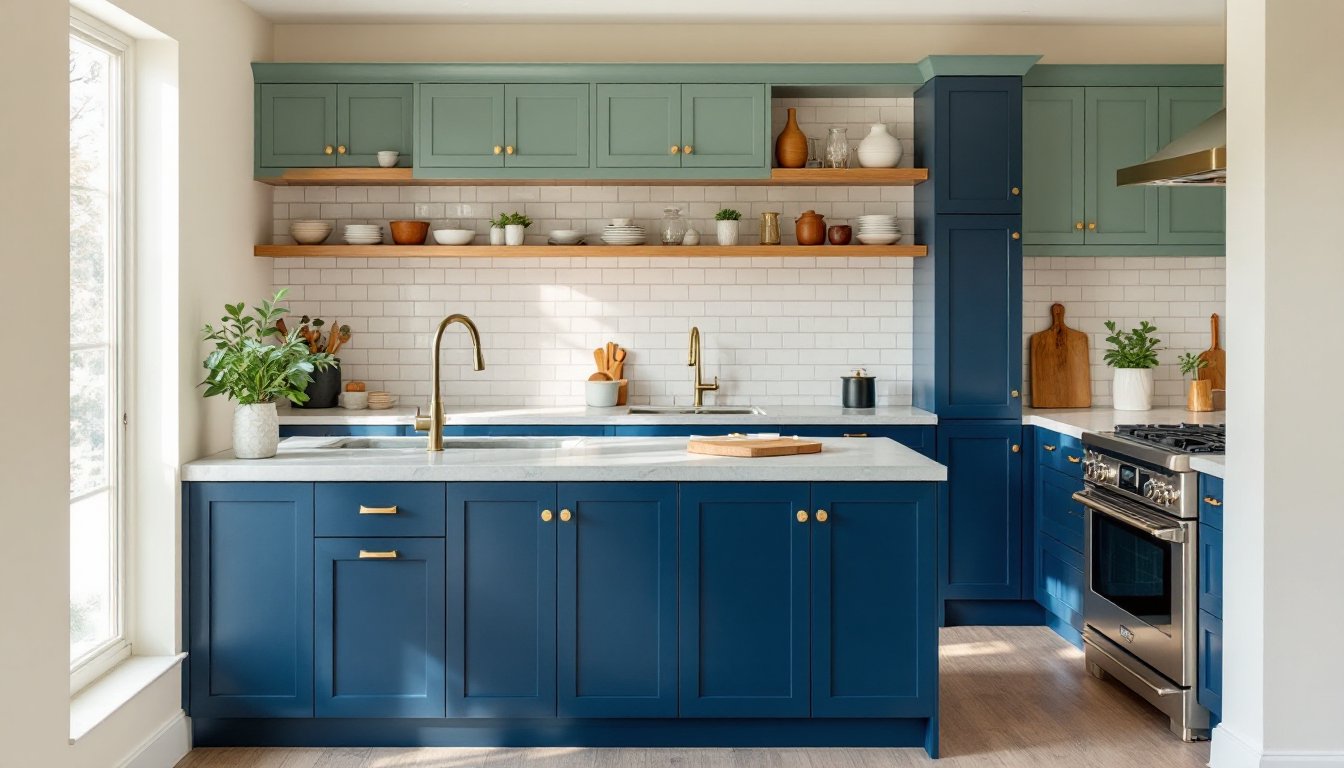
Deep jewel tones, navy, emerald, sapphire, dominate 2026 kitchen trends. These pair beautifully with warm gold, brass, or copper hardware and natural wood accents. A navy kitchen feels sophisticated in traditional or transitional homes and modern in minimalist settings, depending on what surrounds it.
Warm earth tones remain steady: burnt orange, terracotta, ochre yellow. These colors work especially well in farmhouse and Mediterranean-inspired kitchens, but they also surprise in contemporary spaces paired with white subway tile or polished concrete countertops.
Sage and muted greens hit the sweet spot between nature-inspired calm and visual interest. Green kitchens feel less “trendy” and more timeless, which appeals to owners worried about color regret. Pair sage with stainless steel or matte black hardware for a balanced, modern look.
And then there’s the dark moody look: charcoal, near-black, deep grey. These work best in kitchens with substantial natural or well-planned artificial light, because they’ll absorb light. They pair beautifully with white subway tile, marble, or light wood butcher block countertops to create dramatic contrast.
Real-world inspiration: explore colorful kitchen design options to see how colors look in finished spaces, not just in paint chips.
Colorful Cabinets: The Foundation of Bold Kitchen Design
Cabinets are your biggest color investment because they occupy the most visual real estate. You have two main routes: painting existing cabinets or replacing them.
Painting existing cabinets is the budget-friendly option and entirely doable for a DIYer with decent prep discipline. The process: remove doors and hardware, clean thoroughly with TSP (trisodium phosphate) or a grease-cutting degreaser, sand with 120–150 grit sandpaper to dull the finish, prime with a bonding primer, and apply two coats of quality cabinet-grade enamel or lacquer paint. The surface prep is non-negotiable, most cabinet paint failures come from rushing this step.
Use a paint designed for cabinetry, not standard interior paint. Products like Sherwin-Williams Emerald Exterior or Benjamin Moore’s Advance are formulated to harden to a durable finish without brush strokes. Budget 3–5 days including drying time.
New cabinet doors and boxes let you choose finish and sheen precision that paint sometimes can’t match. Pre-made colored cabinet options are increasingly available through companies like IKEA, Semihandmade (which makes fronts for IKEA frames in custom colors), and brands like Shaker Style. Custom cabinetry offers unlimited color options but costs significantly more.
If replacing, decide: do you want a solid color, or are you open to two-tone cabinets (different colors on uppers and lowers)? Two-tone adds sophistication and breaks up a large expanse of color. A common approach: lighter or contrasting color on top cabinets, bolder color on lower cabinets and island.
Don’t overlook hardware. A colored cabinet with the wrong knobs or pulls will feel incomplete. Brass, gold, and copper suit warm colors and jewel tones. Matte black or brushed nickel work with cool palettes.
Walls, Backsplash, and Accent Features
Once cabinets anchor your color scheme, walls and backsplash extend it.
Walls don’t have to match cabinet color, but they should harmonize. If your cabinets are a saturated sage green, try a soft, desaturated cream or light gray on walls, this keeps the kitchen from feeling like a colored box. Alternatively, a tonal approach using a lighter or darker version of your cabinet color on walls creates seamless flow. Recent interior design trends show soft, greyed-down colors on walls paired with bolder cabinet hues.
Backsplash is your chance for a second accent. A navy cabinet kitchen loves a white subway tile backsplash with dark grout, or even a patterned tile that pulls in a complementary accent color. A sage cabinet kitchen reads beautifully against warm terracotta or cream-colored tile. Subway tile, metro tile, and penny rounds in solid colors are affordable and timeless. If you want pattern, stick to small tiles or limited color combinations to avoid visual overwhelm in a small space.
Installing tile requires a level surface, proper adhesive (thinset mortar for most applications), and grout. It’s achievable for a confident DIYer, but remove any existing backsplash carefully (wet a wallpaper scraper with water to soften mastic) and prep the wall surface, it must be smooth and clean.
Accent features like open shelving painted in a complementary color, a colorful kitchen island, or painted beam soffits add dimension without overwhelming. Painted shelves work best in kitchens with sufficient wall space and when the shelves themselves are structurally sound (no wobble under load).
For colorful kitchen inspiration that includes clever backsplash choices, explore statement tile designs to see how bold tile complements bold cabinetry. You can also browse playful kitchen ideas for real examples of how other homeowners layer color.
Conclusion
A colorful kitchen isn’t a fleeting Instagram moment: it’s a practical, achievable upgrade that transforms how a space feels and functions. The key is starting with a clear-eyed color palette anchored to your kitchen’s fixed elements, committing to proper surface prep, and understanding that bold doesn’t mean reckless, it means intentional. Whether you’re painting existing cabinets over a weekend or investing in new cabinetry in your chosen hue, the color you choose will define your kitchen’s personality for the next decade. Make it count.